Cross-posted from our Cyclescape blog:
Over the last five years, we’ve received lots of feedback about our Cyclescape website, which started in 2012, as well as much experience ourselves as users.
As a result of funding from our new project StreetFocus, we’re pleased to announce that we will shortly be starting work on a full-scale redesign of the Cyclescape site. We expect the design work to be finalised in February and will then be rolling out as developer time permits shortly after that.
This will be a full-scale revamp. As well as a fresh visual look and a new mobile-friendly interface, this will tackle seven key areas of usability:
- Generally, reorganising screens to reduce confusion and make the site concepts much clearer and easier to understand;
- User onboarding process is poor – currently users have to go through far too many screens to get set up;
- Lightweight issue reporting model, so that many more issues can be reported in a more lightweight way;
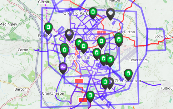
- The issues map is unusable when many area-wide issues present – we want the map to be a stronger focus, and much nicer;
- Subscription by theme, e.g. ‘cycle parking’ rather than purely by geographical area;
- Dealing with general chat discussions that are neither geographical nor administrative, which has always never really worked;
- Planning application integration to add new features such as automatically linking to key documents.
Please do take the opportunity to fill in our survey to give us your thoughts on the site.

An unusable map – one of the many problems we plan to tackle